
Bike Kit Branding
Working with the non-profit Serpentijn Art + Athletics, we created a bike race kit based off of the morals of the non-profit. Biking is for everyone. The inclusive and creative team wanted something that emmulated a French toile, a pattern. The word “Serpentijn” a Dutch word for a snake like shape. From this, I chose to show the story of how it looks on the streets of Amsterdam, which is often known for biking. A parallel view of a canal creates a stripped, snake like pattern when viewed from far, as it would be when the cyclist go by.
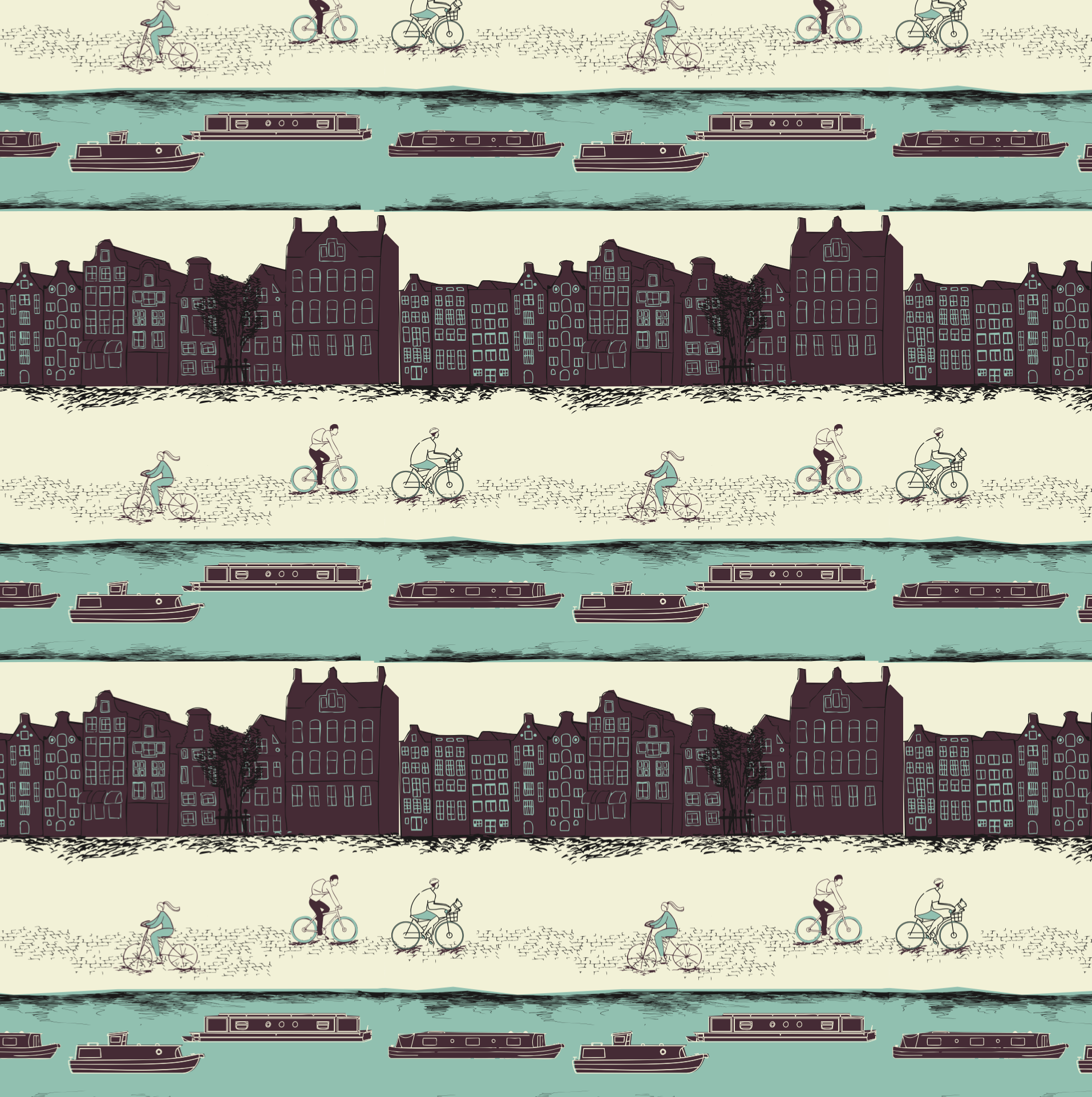
Final Pattern

Final Pattern on Jersey Mockup
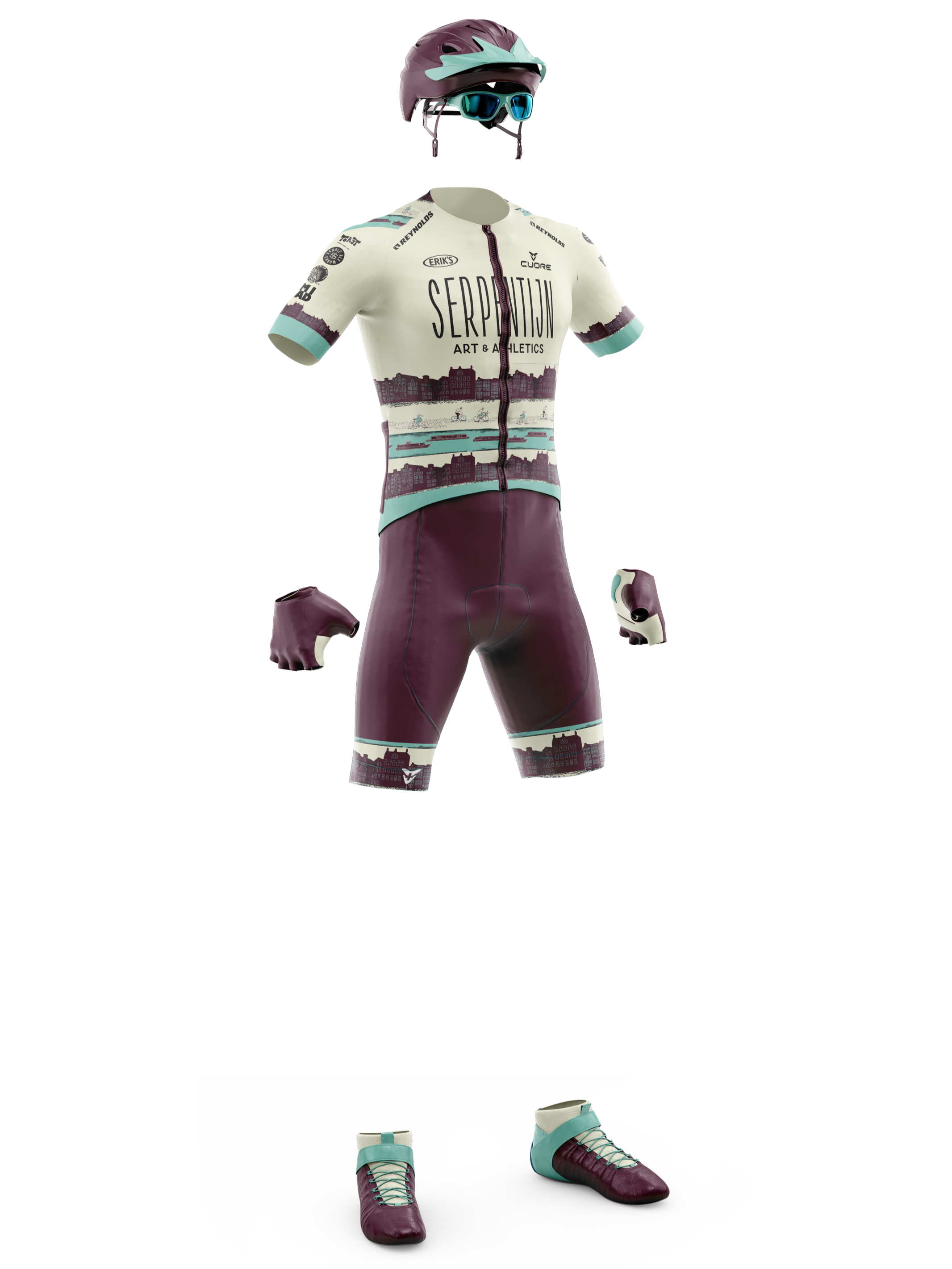
Full Kit
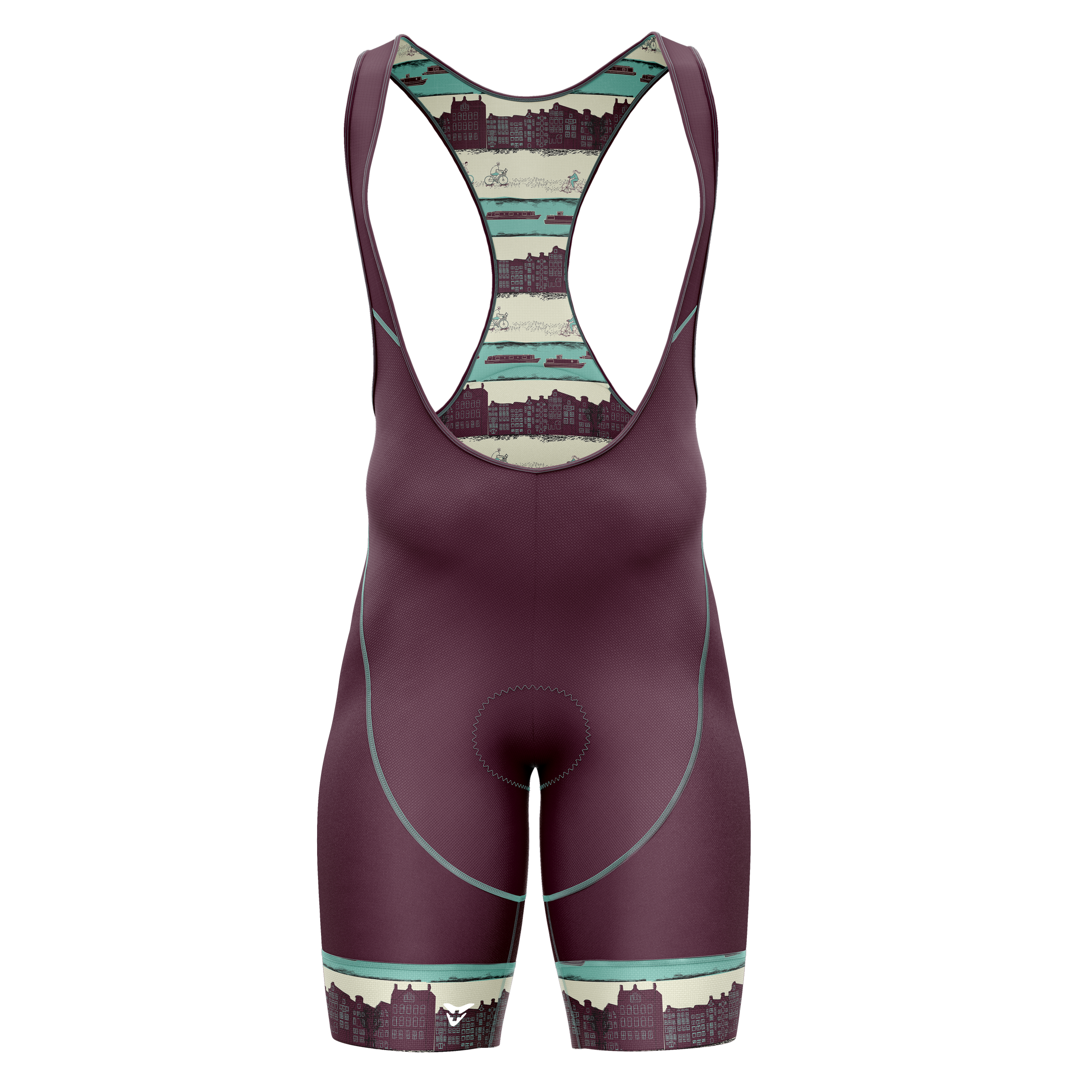
Bib Front
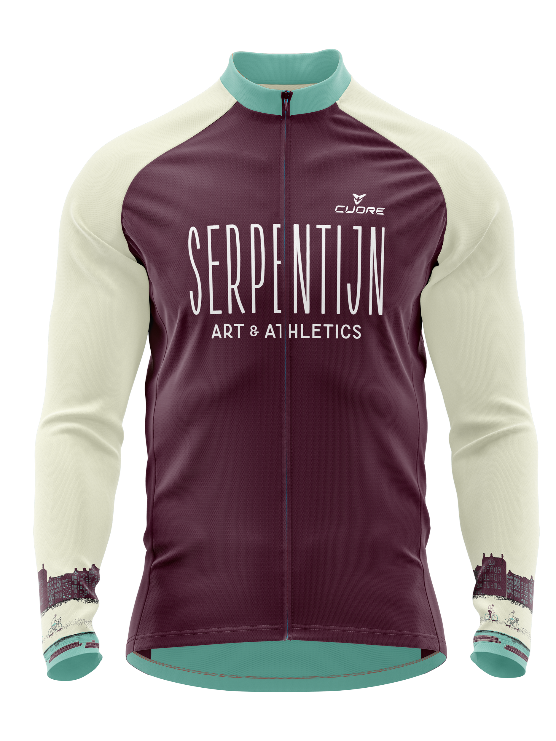
Thermal Jacket